Planning how to use your blog VS your Facebook, Twitter, Pinterest, G+, etc: what is each one for?

/ Friday, May 18, 2012 /
This article describes working out how your blog relates to the other communication tools that you use (sometimes called your "social media strategy"), and how members of a community-group can work together to so that their blog, Facebook page are used well. 


It includes a template that you can use to record your own group's decisions about how to use these tools, and a worked-example of such a template.


Your blog vs your email, facebook, twitter, photo albums  


social media lifecycle - email message - internet - facebook - camera - picture
Recently, I used Blogger to make a new website for a community choir. It replaced an older website that was expensive to change.

As we talked about what the choir needed, one challenge was that some people thought that "put it on the website" or "put in on Facebook" was the answer to every issue that involved communicating with members: It took a lot to explain that Facebook and the website are not actually places where existing members look regularly. (Some members are older, and don't even have cellphones that receive SMS/text-messages, much less computers and broadband connections).

Also, people were talking about putting videos of our concerts onto YouTube, and I realised that we would need to work out ways of doing this so as to show us at our best, and not get us into trouble with copyright laws.

I didn't use this jargon when I was talking to them, but the idea I had to get across to the commiittee was
To get a message to people who aren't looking for it, use a "push" not a "pull" or "by the way" message[tweet this quote]

How to make a Tweet-this-quote

That means to use email, text-message, phone call, face-to-face, rather than the website or Facebook page or wall.

I also had to get them to understand that we were not linking our blog and our website - but that the blog would be the website:  it delivers all the features that we need, and most importantly is very easy to update.

Working with the committee to understand their goals and month-by-month activities, I developed this set of questions:
  • how do we communicate with people (email/txt, Facebook, website, pictures, local newspapers)?
  • who is the audience for each tools we use (members, potential members, audience, other choirs)?
  • what types of messages to do we send?
  • who is responsible for sending the messages?
  • how they know that it's time to send a message, and what it should say?
  • what can each committee-officer send without getting permission from the committee?
  • what needs to be checked by someone else (or maybe even the whole committee) first?

Showing this in a table helped people to understand the big picture, and the role of the website and the other things that we use.

Your blog & social networks
Downloadable template
It occurred to me that people doing the same thing for their own club, organisation, sports team, non-profit, or even small business, might also like this table.

So here is a blank version of my template (MS Word format) that you are welcome to download and adapt for your own situation.


What the template includes


Is this a social-media strategy for your blog?

The format above is good for helping a membership-organisation work out where their blog/website fits into their overall communications tookkit: social media are just one of the ways that clubs can give messages to people (members, friends etc) and get feedback from them.

But if your core product is your blog, and you want to use social-outposts to promote it, then a slightly different planning approach is needed. In this case you need to get messages to:
  • People who casually visit your blog (via search results, friends recommendations, backlinks), and whose preference for keeping up with what you do is via some other network, AND
  • People who hang out on the "other network" and might notice your content in the other place and then visit your blog as a result.

To meet these needs, you need to put links to all the material on your blog into the other social networks - as well as using whatever content promotion techniques work best on that network. You probably also want to put some follow-invitation links on your blog, too. This is unlike the "website as targeted communications tool" approach, where you only put certain, very specific content onto your blog/site.

I'm still working on the fundamental difference between the two approaches, and what sort of worksheets might help people to plan for the 2nd case. Any suggestions on what I need to cover?


Related Articles:


Copyright, blogs and bloggers.

How to link your blog and your website

Linking your blog to the social networks

Showing a PowerPoiint presentation in your blog, as a slideshow

Docs research panel beats Zemanta gadget

/ Wednesday, May 16, 2012 /
Google Docs now has a research pane available while you're writing.   Basically this is a quick way to access google-search results.

To use it:

  • Select a word
  • Right-click the word
  • Choose Research from the tools menu.

Or just select the word and hit the key-combo ( Ctrl+Alt+R on Windows or Cmd+Alt+R on Mac) if you think mice are evil time-wasters.

This is a far better than the Zemanta gadget that was offered to Blogger users back in 2010; research is done only on the words you want researched, not everything that you're writing. My experience was that the latter approach  slowed my machine down horribly, and mostly added no value because it just distracted me from what I wanted to write. Other people seemed to feel the same way, and for a while How to disable Zemanata in blogger was popular reading.

Personally, I'm not sure research-pane will be enough to convince me to write my posts in Docs and load them to Blogger from there: a lot of my research is about "how does Blogger handle this", which I can only find out my testing it.  But it will be a very handy tool for bloggers in some niches.

A couple of things to be aware of:  the pane  offers you imagees that you can "drag into your document", and it add footnotes saying where the image has come from. But the last time I loooked, documents loaded from Docs to Blogger didn't maintain footnotes. And even so, if the image is copyright, you can't get permission to use it in your blog just by linking to the source.

Six simple subscription buttons for Blogger

/ Monday, May 14, 2012 /
This article shows how to make a very simple row of subscription buttons, using image files that you host yourself.

Simple Subscription Icons 

Keep it simple stack of buttons
In the sidebar of my blogs, there is a very simple set of subscription buttons.  Visitors can use them to sign up to follow me (ie my blog's account) on Facebook, Twitter, RSS, LinkedIn, PInterest, etc.

These buttons don't fly-in, hover, shine, zoom, slide, pop out of egg-shells, sing songs or wash the dishes[tweet this]

They don't take up any more space than is absolutely necessary. They don't spend load time calculating how many followers you have.

But they work.

This article is in response to a reader, who asked how to make a similar set of sign-up buttons for himself.   It's a little longer than some similar articles, because I wanted to give enough detail so you understand what needs to be done, and why.

How to make simple subscription icons for your blog:

1  Decide which social networks

You need to consider which of the social networking services you want to use to promote this blog.  Some people will say "all of them", but this isn't a great idea - it can take a lot of time, and if your blog's target audience aren't using a network, then you don't need to be there either.

So, make a list of the services you want to offer a follow-option for, and make sure that you have an account there for your visitors to subscribe to. This may be a personal account or a business / group / community / entity-page, all that matters is that you know how to refer to the account you want to offer a subscription too.

Some of the common ones are:
  • Facebook
  • Twitter
  • RSS
  • Google+
  • LinkedIn
  • YouTube
  • Pinterest

Remember, these icons are for inviting your readers to follow your "social media outpost" on the other network:   for them to be useful, you need to be regularly posting on the networks you offer.

2  Get image files

The image file for each button you use needs to come from somewhere.  Some social networks provide it for you, and are happy to provide a copy each time your blog loads their subscription button.

But others don't.   For them, you need to make your own copy of the icon image-file that you need for the services you've chosen.

Google+, Feedburner and Twitter provide images, so you don't need to organise files for them yourself.

You are welcome to borrow the files shown below, which I've borrowed from elsewhere, I believe legally.   If you want to use one of these files,
  • right-click on the picture shown here, 
  • save the target somewhere 
  • upload it to the file-host of your choice (I recommend Picasa-web-albums)
  • and keep a note on the picture's URL wherever you loaded it to.


You can  also use your own image files. It doesn't matter if they are larger that mine, because the code re-sizes them. But for it to work properly, they need to be square, ie the same height and width.

Whatever icons you decided to use, you need to upload them to an image-host: I use Picasa-web-albums (ref What is Picasa?), but you may prefer a different picture-file host,

Make sure that you can find out the URL for each image.

Why this approach? Many people offering gadgets like this just let your blog link to their own copy of the images. But I don't like this - because if I ever move the file, your gadget will fail. I think you need to have and use your own copy, so I'm not responsible for your buttons working years in to the future.

3  Customize the gadget code

This is the basic code for the gadget bar.   Copy this into a text-editor (eg Notepad)
<div style="clear:both; text-align: left; float: left; padding-bottom: 10px;">
<!-- PUT THINGS IN HERE-->
</div>

From the  sections below, copy the code for the services that you want, and paste it into the area between the <div> start and end statements, ie where <!-- PUT THINGS IN HERE--> is.

Notice that I've shown you what each block of code is for by using comments at the start and end, like this:   <!-- THIS IS THE CODE FOR FACEBOOK-->       The <!--     and -->    are the way to say "ignore what's in between here" in HTML.

For each service that you want to show a subscription button for, replace
  1. The account name that you want your readers to subscribe to
  2. Any other items in UPPER-CASE  (eg Twitter's "via" parameter)
  3. The URL for the button image (if necessary)

<!--  THIS IS THE CODE FOR GOOGLE+ -->
<a href="https://plus.google.com/YOUR-GOOGLE-PLUS-ID?prsrc=3" style="text-decoration:none;">
<img src="https://ssl.gstatic.com/images/icons/gplus-32.png" alt="Subscribe to YOUR-BLOG-NAME on Google +" style="border:0;width:32px;height:32px; margin-left:5px; margin-right:5px;"/>
</a>
<!--  END OF  THE CODE FOR GOOGLE+ -->
<!-- THIS IS THE CODE FOR FACEBOOK--><a href="https://www.facebook.com/YOUR-FACEBOOK-NAME" imageanchor="1">
<img src="URL FOR THE FACEBOOK ICON"  alt="Follow me on Facebook" style="border:0;width:32px;height:32px; margin-left:5px; margin-right:5px;"/>
</a>
<!-- END OF THE CODE FOR FACEBOOK--> 
<!-- THIS IS THE CODE FOR YOUR RSS FEED--><a href="<b>YOUR FEED ADDRESS</b>" rel="alternate" type="application/rss+xml">
<img src="http://www.feedburner.com/fb/images/pub/feed-icon32x32.png" alt="RSS subscription icon" style="border:0;width:33px;height:33px; margin-left:5px; margin-right:5px;"/>
</a>
<!--  END OF THE CODE FOR YOUR RSS FEED-->
<!-- THIS IS THE CODE FOR TWITTER --><a href="http://www.twitter.com/YOUR-TWITTER-ACCOUNT-NAME">
<img src="http://twitter-badges.s3.amazonaws.com/t_logo-a.png" alt="Follow  <b>YOUR-TWITTER-ACCOUNT-NAME</b> on Twitter" style="border:0;width:33px;height:33px; margin-left:5px; margin-right:5px;" />
</a>
<!--  END OF THE CODE FOR TWITTER -->
<!-- THIS IS THE CODE FOR YOU-TUBE  --><a href=" http://www.youtube.com/user/YOUR-CHANNEL-ID">
<img src="YOUR YOU-TUBE IMAGE LOCATION" alt="Follow YOUR-CHANNEL-ID on YouTube" style="border:0;width:33px;height:33px; margin-left:5px; margin-right:5px;" />
</a>
<!-- END OF THE CODE FOR YOU-TUBE -->
<!-- THIS IS THE CODE FOR PINTEREST --> <a href="http://pinterest.com/YOUR-PINTEREST-ACCOUNT-NAME/">
<img src="http://passets-cdn.pinterest.com/images/about/buttons/big-p-button.png" style="border:0;width:33px;height:33px; margin-left:5px; margin-right:5px;"alt="Follow Me on Pinterest" />
</a>
<!-- END OF THE CODE FOR PINTEREST-->
<!-- THIS IS THE CODE FOR A LINKED-IN PERSONAL PROFILE--><a href="http://www.linkedin.com/in/YOUR-LINKEDIN-PROFILE-NAME/">
<img src="YOUR-LINKEDIN-PICTURE-URL" style="border:0;width:33px;height:33px; margin-left:5px; margin-right:5px;" alt="Follow Me on LinkedIn" />
</a>
<!--  END OF THE CODE FOR LINKED-IN-->
</div>

4  Add the gadget

  • Add a gadget to your blog in the usual way: The type of gadget to use is HTML/Javascript.
     Put the customised code that you made into the Contents field.
  • Choose whether to give it a title ("subscribe" works with techy audiences, but in other niches phrases like "follow-up" or "get free updates" are better).
  • Choose where to put it:
    If the space that you have available is too narrow, you may like to tweak the code - see below for more on this.
  • After you've saved the gadget, test all the buttons to make sure that they all work they way they should

5  Back up the gadget code

Blogger doesn't have any way for us to back up the settings inside our gadgets.

And it's very easy to either accidentally delete the whole gadget, or lose the code becasue you try to change it and make an error:  if the HTML-gadget editor sees an error in your code, it doesn't tell you about the problem, it just deletes the code that it does not understand.
Because of this, I very strongly recommend that you keep a backup copy of the code

Some people use a text file for this. Personally, I usually keep it in a post in the private documentation blog that I keep for each of my main blogs.   Either way, it's important to keep it up to date as you do "tweaks".


Adjusting the button sizing and spaces

Depending on the width of your sidebar, and the margins inside any button-pictures that you use, you may want to tweak the code a little.   This is easy enough to do.    Notice the structure of each piece of button code:
<!-- THIS IS THE CODE FOR A WHATEVER -->
<a href="THE URL TO SUBSCRIBE TO">
<img src="THE IMAGE LOCATION"
style="border:0;width:33px;height:33px; margin-left:5px; margin-right:5px;"
alt="Follow Me on LinkedIn" />
</a>
<!--  END OF THE CODE FOR WHATEVER-IN-->

I've put a few line breaks in, so you can see that there is
  1. Opening comment
  2. A href statement = the address of what is being subscribed to
  3. The image address, 
  4. Style commands for the image
  5. alt-text (the latter is read out to visually-impaired people)

To change the size or position of the icon, or the space between then, just change the values in the Style.

Adding more social networks

To add new services to this, you just need to follow the same process, ie
  1. Make an account to follow
  2. Get an icon-shaped (ie square) image to represent it
  3. Add a block to the code, with the "follow-me" code from the relevant service in it.
  4. Post regularly to the account you made  (or else there's no point in asking people to follow you there.


Are there any other social networks or subscription options that you'd like me to add to the list above? Let me know, and I'll see if I can figure out the code for you.


Related Articles:


Linking your blog to the social networks

An introduction to Picasa and Picasa-web-albums

File-hosting options

Adding a Follow-me-on-Twitter button

Spam links can be invisibly embedded in comments

/ Friday, May 11, 2012 /
The pseudonymous John of Gordon's Tech reports that spammers have found a way to put links into comments so that they don't look like links when we're doing moderation.

Now he mentions it, I've been seeing a lot of comments lately that are something like  
"Nice info, thanks for sharing.   Facebook developers" 
all in plain text.  And the "signature" has often been something that's even less relevant than this.

I had been thinking that they were naive, and didn't know how to put links into comments, so was deleting them rather than marking as spam.   Time to change the comments moderation policy, I think, down the spam-shute they go.

Result-sorting and better filter queries in Google Custom Search Engines

/ Thursday, May 10, 2012 /
Google's have added result-sorting and compact queries for filtering-by-attribute options to their Custom Search Engines (ref: Adding a custom search engine to your blog).

These are most relevant for people who use a CSE over their own blog/site, rather than over other sites which they don't control the markup.

Sorting:

If you have specificd PageMaps, rich-snippets or meta-tags for your posts, you can add them as an option that is available to people who use your custom-search-engine. Do this in CSE by

  • Enable sorting (www.google.com/cse > Control Panel > Basics)
  • Adding the key.


Compact-queries:

The language that is used to state a qeury against defined attributes now supports "and"-ing values together in a more compact way.

How to enable a mobile template in Blogger

/ Wednesday, May 9, 2012 /
This article explains why mobile mattes for some blogs (but not all), what tools Blogger has provided to help with this, and how to set up a mobile template for your blog.

Blogger and Mobile - do you need to care?


By default, when someone uses a smartphone, tablet or other mobile device to look at your blog, they see the "full site" just like they would if they were using a PC.   The pages aren't set up to work well on their small screen, but they have access to all the features and gadgets you've installed.

In some cases, this is fine.  For example, the last time I looked at the statistics for this site, hardly any of the visitors were mobile.   This makes sense - people wanting to find out how to do things in Blogger are probably using the full Blogger software at the time.

But for other blogs, especially ones that have maps and other location-information or which people read on the go, having a mobile-friendly template is very important:   for example, on my public-transport blog, over 25% of visitors are using mobile, and that figure is growing.  Making my site work well for these visitors is definitely important for its long-term future (and my short term advertising revenue!)

What's available

Blogger have made a set of mobile templates, to match the standard Designer Templates, and so far only one to match the Dynamic template.

We cannot control the layout of gadgets on these - when the screen is only 300-ish pixels wide, there's not much room to move.

But we can add and remove gadgets, and also by choosing a custom template get colour settings that match our main blog.


How to make your blog use a mobile template


Log in to Blogger using an account with administrator rights to the blog.


Go to the Template tab.


If your blog has a Designer or Dynamic template, then there will be a Mobile option to the right of the "Live on Blog" area.


If the blog is not set up to use a mobile template,then the word Disabled will be in the middle of the picture area - although it may be hard to read if your base template (chosen in the Live on Blog area) has a picture behind it.


Click on the gear-wheel underneath the picture to see the mobile options.


Select "Yes.  Show mobile template on mobile devices."


Either leave the mobile template on Default, or select one of the other options.
  • If you choose Default, your mobile template will use the standard template matching your desktop template.
  • If you choose Custom, your mobile template will use the colour-scheme and various features from your desktop template, and you will be able to makes changes to these settings.

Use the Preview button if you want to see what your blog will look like with the selected template on a mobile device.


When you are happy with your selection, press Save.


What your readers see

Visitors to your blog who are using a desktop PC (or laptop or netbook or any other machine with a full-size screen) won't see anything different.

Readers who are using an internet-enabled cellphone (ie smartphone), tablet, iPad, etc will see a different view:
  • They won't have a sidebar
  • The gadgets will be limited (unless you add some extra ones) and in the header and footer only
  • On the home-page there will just be the title, thumbnail and snippet for each post, and a button for read-more (this is irrespective of where you've put the jump-break) - notice that the usual methods of giving your blog a home-page don't always work.
  • Custom styles that you have added to the template may not be applied (this has happened on one blog where I use styles, I'm still investigating whether it's a feature of all mobile templates, or just due to the way I added these particular styles).
  • There will be buttons at the bottom of the page for Home, <   and > .    I think that the latter two refer to older and newer posts (though possible they are the opposite way around from what I expect).
  • There will be a link to "view web version", which lets your visitor switch to to see the blog using the desktop template.

I have a  feeling that there may be some other differences too - very keen to hear about any others you've spotted.


Seeing what your mobile readers see

The absolute best way that I've found to accurately experience my blogs as mobile visitors see them is to use a mobile device myself:
  • Just like preview mode in the Post-editor, the mobile-template preview mode shows a "look and feel" view, which is not entirely accurate.   For example in the picture above, it shows part of the most-recent article insteaod of just the post title and mini-snippet that I see when I look at the site on my phone.
  • The screen-size testers that I've tried out (ie software tools that mimic showing your website in various different screeen sizes) don't actually use the mobile template - I suspect that this is due to the way that Blogger detects mobile devices.
However you can see any blog as it would be on a mobile device by appending /?m=1 to the end of the URL.  

For example, to see this blog in mobile, I would look at http://blogger-hints-and-tips.blogspot.com/?m=1 

If you're going to use this approach, it's best to re-size your browser window so that it's about 300px wide - from my netbook, that's about 1/3 of the screen size, but it would be less from machiens with bigger screens.

I'm very interested in suggestions about any other tools that give a reliable mobile-experience view without actually having to use a smartphone.


Related Articles:


Adding gadgets to your mobile template.

Removing the attribution from moblile blogs

Showing a Google custom map on your blog

Advertising programmes for websites

Types of Blogger template

Administrator rights to your blog

Putting scripts behind Google Docs

/ Saturday, May 5, 2012 /
I'd never really thought about whether there was a scripting language with Google Docs spreadsheets (the same way that there's VB scripting with Excel).   But really it makes sense for there to be Javascript there.  (I have no idea if it's a new-ish feature, or has been there all along.)

This article from Blogger Xpertise not only got me thinking about the possibilities, but also has a useful script for making embeddable custom forms created in Docs a good deal more useful

Google's guide to HTML and CSS styles

/ Thursday, May 3, 2012 /
Google have released their own style guide for HTML and CSS code.

It will be interesting to see how much of it they apply in future changes to Blogger templates

But for Bloggers who do a lot of modifications to their own template, there might be some useful tips. I especially like the one about putting CSS rules into alphabetical order for maintainability.

Doing this would mean adding CSS rules manually rather than than through Design > Customize > Advanced > Add CSS

And it will be harder to do a code-compare to see the difference between our customized template and the current standard-issue ones.  But storing like-named rules together appeals to me more than just tagging new ones on the end.

Use Image Search to research picture ownership

/ /
If someone shared a cool photo with you on Facebook or Pinterst, you might want to write a blog post about it.

The post will be a lot more interesting if you can actually include the image. But you're not allowed to put copyright material onto your blog without permission - and how do you know if the picture that was shared with your is copyright or not, and who owns it.

Google Image Search may be part of the answer. Find out about it.

It won't tell you if a picture is definitely avaiable or not - but it gives you information from you can make some judgements based on when it first appeared, and what sort of web-sites it has appeared on..

Remember - although you're not allowed to publish copyright material, you will only get "caught" if a copyright owner spots something on your blog and takes action by filing a DMCA report. There are a great many items which are fine to share, even though they're not technically in the public domain, because no one is actively claiming ownership - and image search gives a way of validating ownership claims made by chancers.

Crop and re-size photos stored in PIcasa, without HTML

/ /
Some very interesting info from David of Blogger Xpertise about controlling the display of photos from Picasa by manipulating the URL.   What he's found is nothing that we couldn't do with HTML, but I have a feeling that it might point to some other possibilities using Picasa's URLs.   Ref:   http://blogxpertise.blogspot.com/2012/05/tip-automatically-cropping-square-and.html

Becoming a Google Trusted Photographer

/ Wednesday, May 2, 2012 /
Previously I described Google's Trusted Photographer's programme, which could be a nice business opportunity for serious photo-bloggers.

At that time, Google were selling business-owners the idea of using a TP to take photos of your business and upload them to Places/Maps. But they were pretty vague about how to become a TP.

Today, they've given links to far more info about how it works and how to to sign up as a Google trusted photographer.

Designing blogs for mobile devices - liquid design and image-width-maximisation

/ Tuesday, May 1, 2012 /
Today I read a very interesting article from the Webmaster Central blog about the challenges of designing websites for mobile devices, and a concept called liquid design.

For bloggers who have enabled a mobile template for their blog, the overall site design is handled by Blogger: you can add gadgets to your mobile template easily enough, and if they're in the sidebard then Blogger decides where to show them instead.

But the design inside posts is our own responsibility. I've been pondering this for one of my blogs that definitiely needs a mobile-template view, but which has a number of side-by-side images.

I'm not certain yet, sure, but the article's suggestion to add this CSS rule to my template
img {
max-width: 100%;
}

might just be a very good one for me to apply.

Adding gadgets to your mobile-template makes your blog better for smartphone visitors

/ /
This article shows how to add gadgets to the mobile version of your blogger template.

Gadgets and mobile templates 

Previously I've described how to add a gadget to your blog.

If you have not enabled a mobile template for your blog, then visitors who look at it using a mobile device (smartphone, tablet etc) will see all your content and gadgets.   But they will probably have to scroll left and right a lot, because your blog will be a lot wider than their screen.  There might be some issues if you have gadgets that require javascript or particular media players, which their device doesn't have installed. But these are exactly the same as the issues for your visitors who are using desktop computers.

But if you have enabled a mobile template, then readers who are using a mobile device see a different design which is tailored to their screen-width, though still using the colour/theme that you chose.

Blogger faced some challenged when they built these mobile templates: many bloggers put a lot of effort into design and providing gadgets that.    But a 300-ish pixel screen simply does not have room for a sidebar and blog content, and may not have space for some of the things that gadgets do, either.

What Blogger have done is to say that only some gadgets are normally shown on mobile-template versions of your blog:
  • Header
  • Blog Posts
  • Profile
  • Pages
  • AdSense
  • Attribution

However it's easy to add other gadgets to your own customized mobile template, and to set up gadgets that are only seen by readers using mobile-devices - provided you are willing to take the risks of editing your template.

(I've described how to remove the attribution gadget from mobile-templates before, because it's one that some people particularly hate - and of course the same approach can be used for the other standard gadgets too.)


How to add a gadget to the mobile template

First, check that mobile has been enabled for your blog, and that your mobile template is set up to show customizations:   go to the Template tab, click on the gear-wheel under mobile, tick Yes (for show mobile template), then select Custom, and press the Save button.


Add the gadget to your blog, in the usual way:  when you are choosing the parameters, make sure you think about the amount of screen-space that your mobile-readers will have to see it.

Find the gadget ID.

Edit your template: you don't need to expand the widgets.

Locate the gadget code, by searching for the ID you found (tip: use your brower's search function, eg ctrl/F). It will look something like this (slightly different, of course, if the gadget you are working on is of a different type):
<b:widget id='PlusBadge1' locked='false' title='Google+ Badge' type='PlusBadge'/>
To show the gadget on the mobile version of your blog, add mobile='yes' to the code, like this:
<b:widget id='PlusBadge1' locked='false' mobile='yes' title='Google+ Badge' type='PlusBadge'/>

To show the gadget only on the mobile template and not to desktop users, add mobile='only' to the code, like this:
<b:widget id='PlusBadge1' locked='false' mobile='only' title='Google+ Badge' type='PlusBadge'/>

Save the changes.

Use either a mobile device (ideally), or another tool that lets you test blogs as they would appear on different screen sizes, to check that the gadgets are showing as you think they should.


What gadgets should you add to your mobile template?

There are no hard-and-fast rules here:   it's all about what you want your mobile visitors to be able to access.   I have seen people add blog-rolls, linked-lists, polls, profiles, and various other simple widgets.

Gadgets that I think could be more troublesome are slideshows, popular posts (if you try to show a thumbnail), newsreel, subscriptions, gadgets from Amazon.com and other 3rd parties.

You just need to remember amount of screen space which your visitors have, and how large the images are likely to be for them.   And also that gadgets are likely to be shown as the bottom of the list-of-posts (which is how the blog-posts gadget shows the home page of your mobile blog), so won't be nearly so obvious as they are in the sidebar.


Why put gadgets only in the mobile blog?

You may wonder why a gadget should only go on the mobile version.

One reason is to provide a simpler alternative to a full-featured gadget that is shown on the non-mobile version of the blog. For example, I use a two-page google-custom-search option here on Blogger-Hints-and-tips. This lets me control what sites are searched, and use some advanced display features. But a mobile-sized screen won't cope with this. So if I wanted to make Blogger-HAT more mobile-friendly, I'd add a regular search-gadget, but only show it to on mobile-devices so that non-mobile visitors didn't get confused.


Positioning gadgets on the mobile template

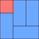
Tatami layout 1As far as I can see, we do not easily have any control over the positioning of gadgets in the mobile-template versions of our blogs.

Some experiments make me think that:
  • gadgets from the header in the regular layout are put above the list of posts in the mobile view
  • gadgets from the footer in the regular layout are put below the list of posts in the mobile view
  • gadgets from the sidebar in the regular layout are put below the list of posts in the mobile view

But there could be more going on here - please let me know if you've worked out any more rules that are applied.

Also, I have no idea how mobile templates will cope with tricks like gadgets that are put above your header: test your blog extra carefully if you've tweaked your template in this way before adding mobile-specific tweaks.


Troubleshooting

Stopping gadgets from showing on mobile-template blogs (ie adding mobile='no') does not require you to choose the Custom option from the list of mobile template.   But adding them (except for the ones in the default list) does.

The default mobile gadgets are  only shown if you have put them onto your blog template: if they are not in your blog at the moment, then they will not automatically be shown just because you enable a mobile template.

What other problems have you had with mobile-templates?


Related Articles:


Putting a gadget into your blog

Turning your blog's mobile template on

Advantages and disadvantages of editing your blogger template

Finding the id for any gadget

Adding a google-custom-search

Giving your blog a home-page

Labels

Thank you for visiting my site. I’m the author of home decor help, home garden decor, home design interiors, tina 4 home design, uhozz, visit yogurt lab, sitazine, is beauty tips and sunnijati website. Modestop Topmodest Free Beauty Tips Shitazine Sitahouseblog Izhealthy Shitadesign Sitahouse Topmodest Sitazine Irezine Home- decor-design Shitadesign Shitadesign-dot-com Inhomeland inhouseland ghiuldenika inebautystyle enterarteiuna radiodominiopublico biberealexandru fabiobernadosdi geeklore31 syahadah-alhafeezah peaceloveiman bigwideempty techandchefadventures kaosgunlugu fikirkulubleri duazinciri theinternationalrules morefortngintn monkeymanzach lifeatthegreenys photokid84 chelsea-settles chasingmommyhood sexyhotactresseswallpaper tophotnewstodays avvani urbantrendsussex voychic reisyamode sitazine reportmy homedesignideasx mystylepinterest fashionstyleco popularnewstips isexy-hot-girls sexywomengirl trendymodeku derumahdesign womenhairs hackoblogger gadiswomen homeinteriordesignideas1s homedesignideasa uniquehomedesignsw enterpreneurforbloggers earningblogtipss lilyandgiasmom onfeatureblog aboutadsen onblogsocial tecnologiku onlinekutip akuhub caramakemoney youseoneed blogukus newbieblogit adsenseguideto triond-adsense inseoservice intipseoblog otherseoblog freeseoguid seoblognets tawaguideblog seosecretip buzdesign modewomen gayawoman cantikide tipsehat bebeautyps tipsjilbabcantiks idekontenislami healthfitnessnutritionsz jilbab-tips tips-home-decor caramemakaijilbabv beritaremajaterkinie allisoncrewnews mypinspinterest mypinspinterest gogirlsgallery seyhotgirls topmodest worldotgirls seksigirlsblog yourgirlsnet sexywomensia decorativehousedesigns simplebloggertipsz aboutadsense09s marketingner freeseotipstricksz womensiana chicstylegallery oblogkudewe colhomegallery marketserve onlibusiness artodesign designinguide oninteriorhome interiormu intutorblog blogoffeed newbloggerhint enginseo dibisnistips internetmublog onroomdesign homegardenco
 
Copyright © 2010 New Blogger Tips, All rights reserved
Design by DZignine. Powered by Blogger